
Case study · Ella's
Physical and digital, designed as one range
More than 20 product labels, website design and development, and an SEO foundation for an established oil brand in Sweden.
The brief
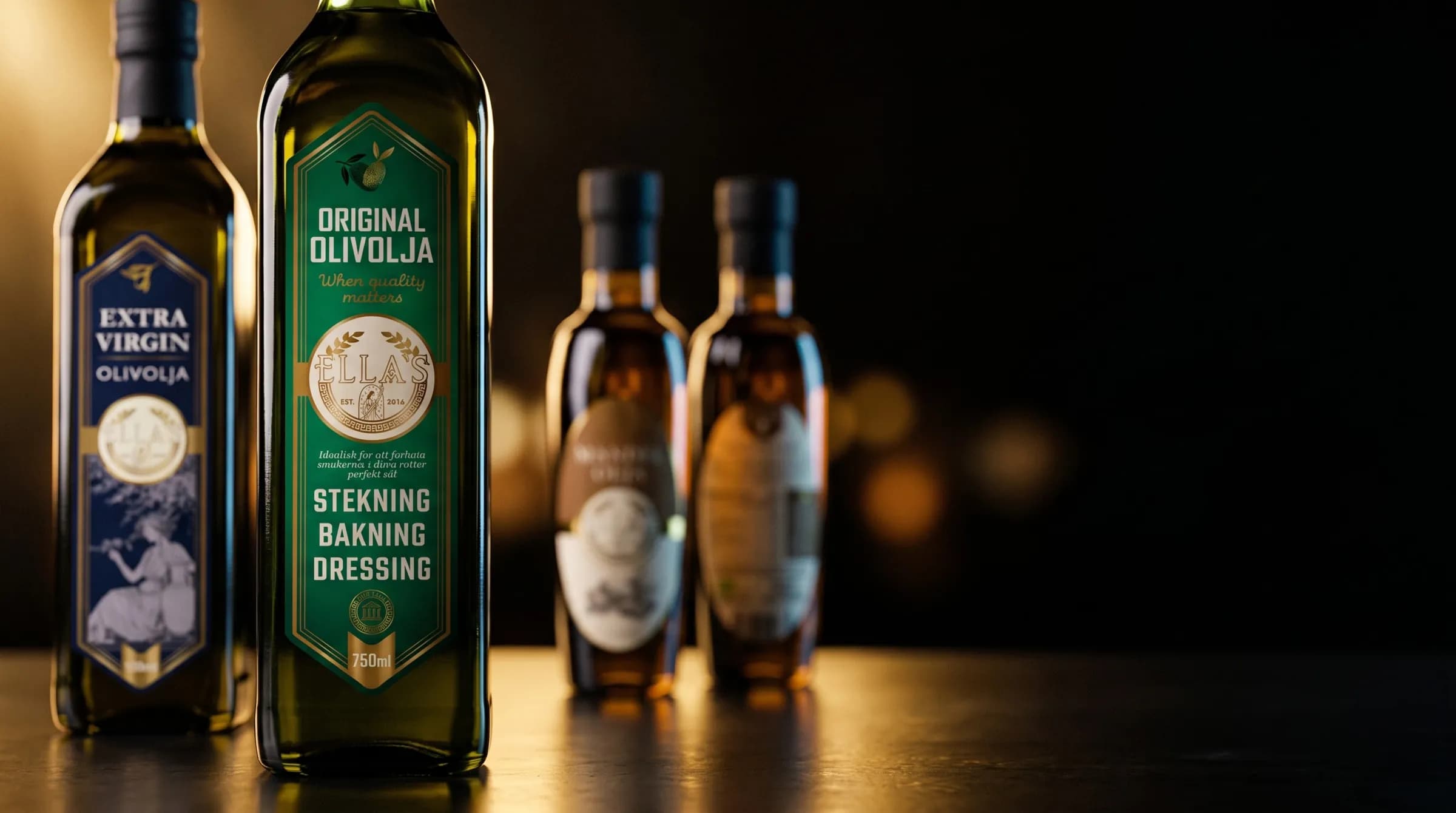
Ella's has sold oils in Sweden since 2016, and we have designed its labels from the start: well over 20 so far. The website carries the same look as the labels, so the range reads as one family on a shelf and on a screen.
What we made
- More than 20 product labels
- Website design and development
- SEO foundation
The packaging
Every part has a reason.
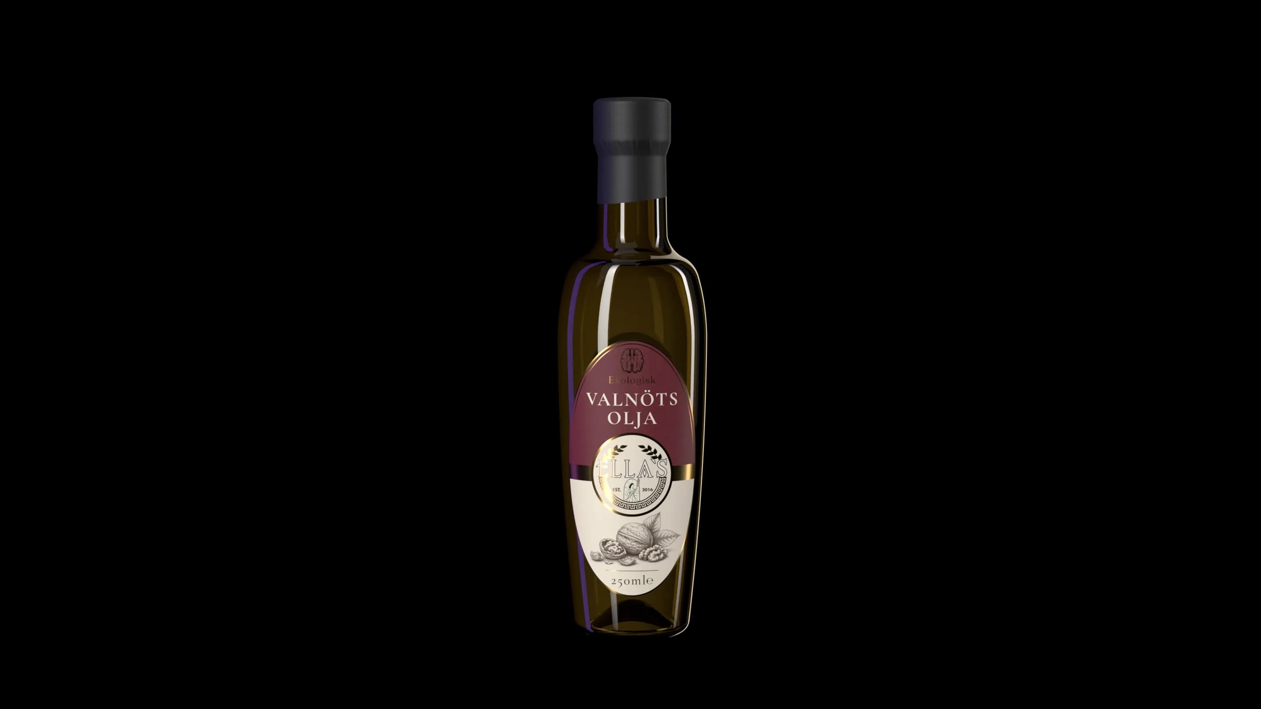
We chose the bottle, drew the die cut and designed the labels for seven of Ella's oils. Taken apart, this is why each piece looks the way it does.
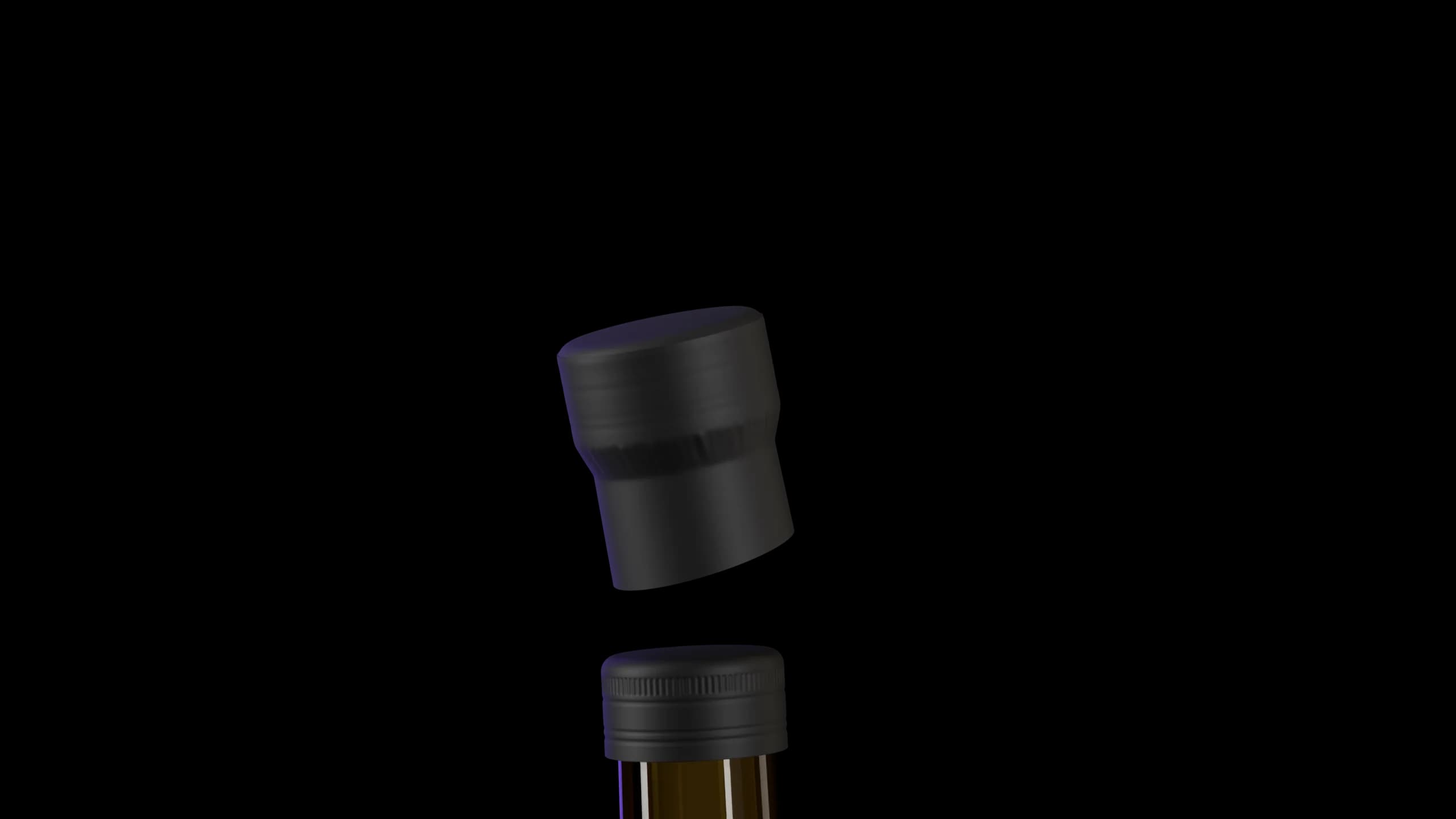
Capsule
Matte black over the cap instead of a bare lid, so the bottle feels premium before it is opened.
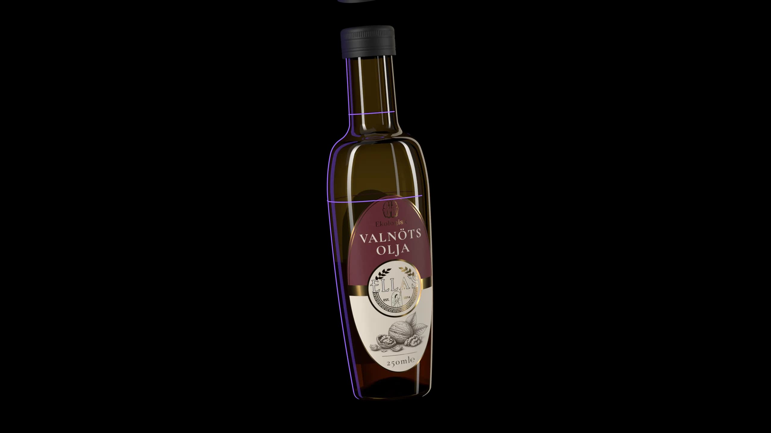
The bottle
An oval among round bottles. We chose it so Ella’s stands out on the shelf.
Built to the drawing
Modelled in 3D from the glassworks’ own drawing, so each label was fitted to the true shape first.
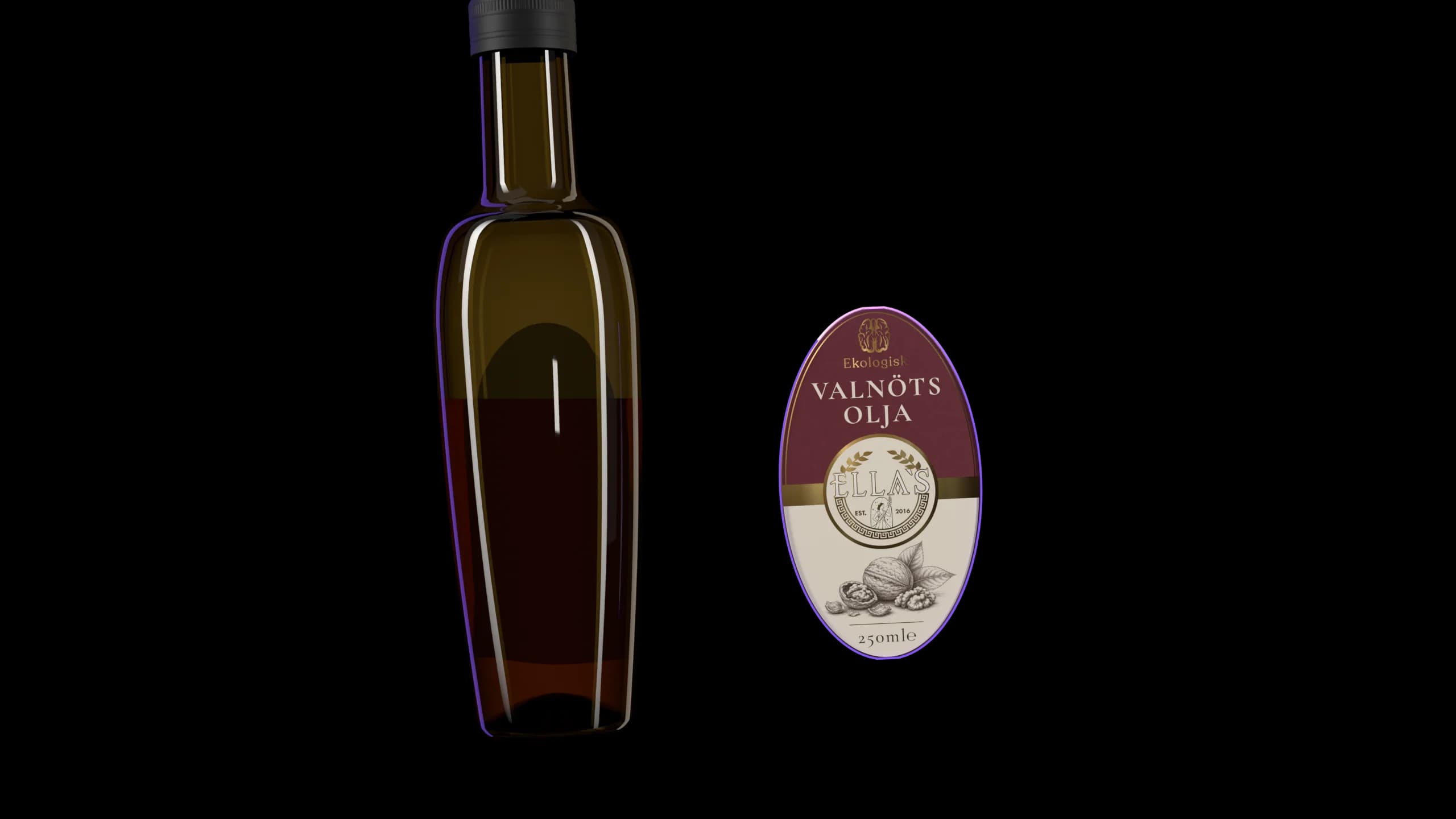
The die cut
Drawn around the Ella’s seal to follow the curve of the bottle. A shape of its own, so the label feels crafted, not stock.
The label
Engraved drawings of what each oil is pressed from, and gold foil, for an old-world feel with a touch of luxury.
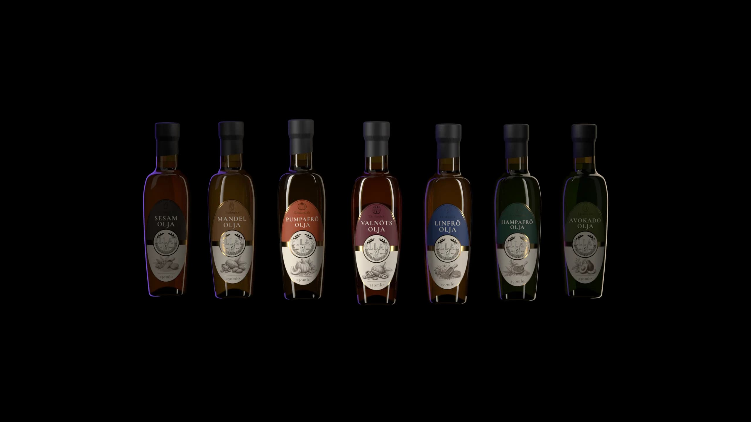
The range
Seven oils, one family.
Each colour comes from its nut or seed: easy to tell apart, clearly one range.
The packaging
Every part has a reason.
We chose the bottle, drew the die cut and designed the labels for seven of Ella's oils. Taken apart, this is why each piece looks the way it does.
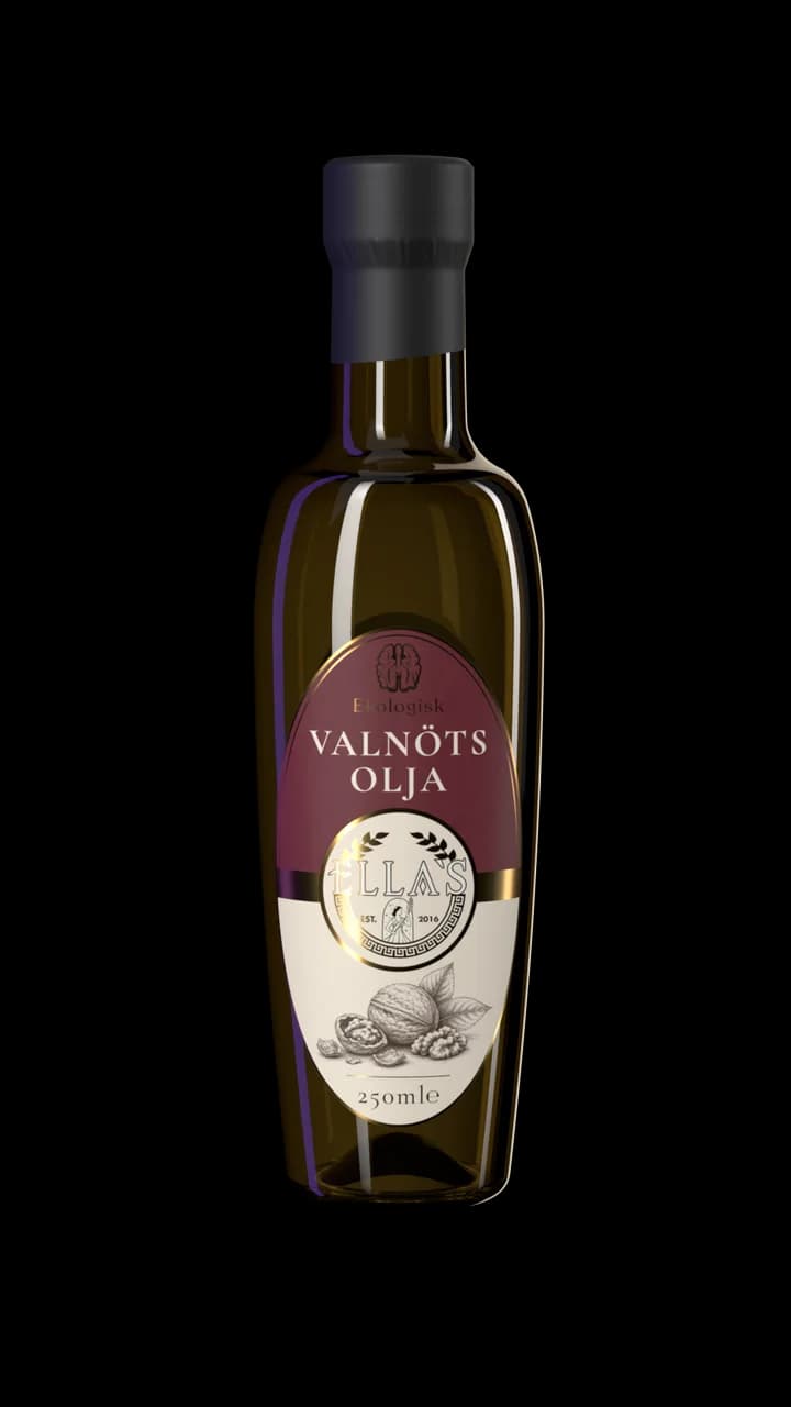
Swipe to take it apart.
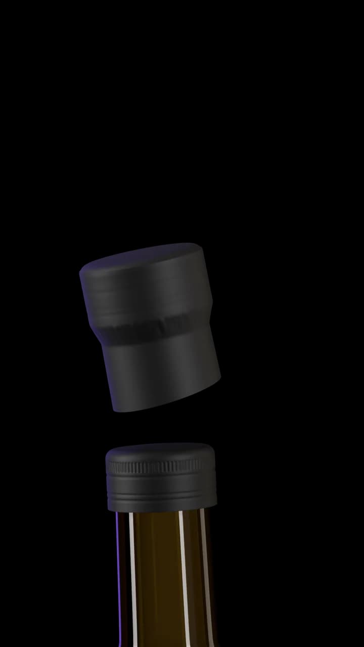
Capsule
Matte black over the cap instead of a bare lid, so the bottle feels premium before it is opened.
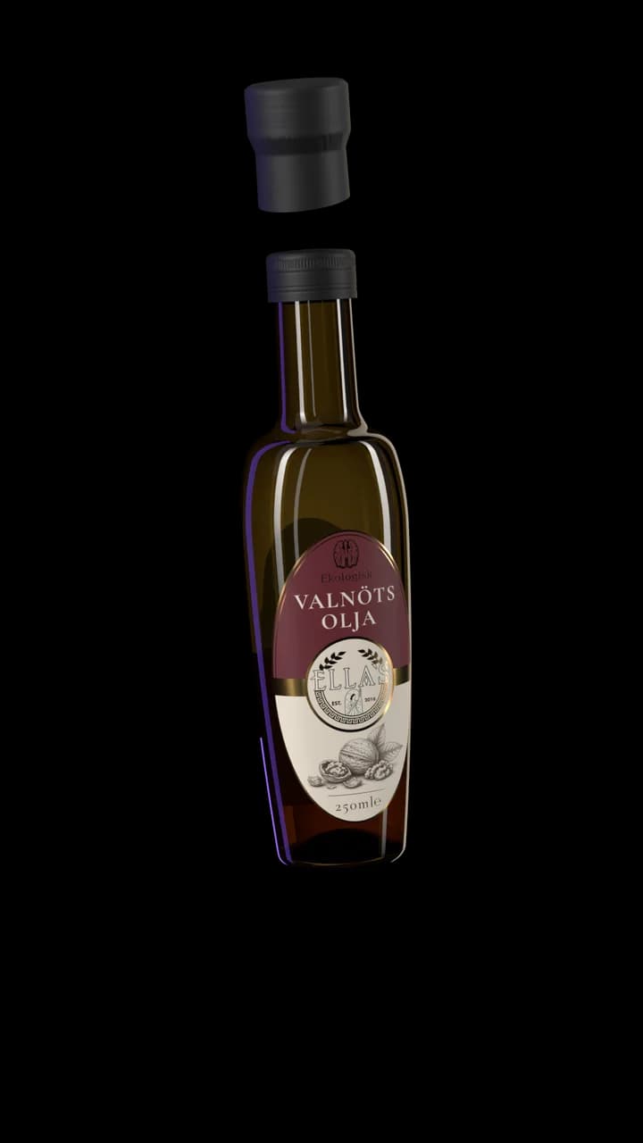
The bottle
An oval among round bottles. We chose it so Ella’s stands out on the shelf.
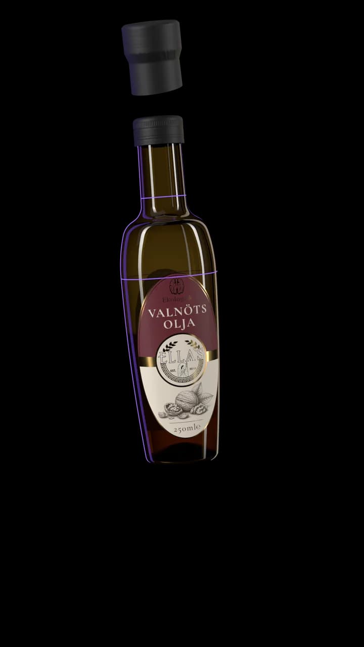
Built to the drawing
Modelled in 3D from the glassworks’ own drawing, so each label was fitted to the true shape first.
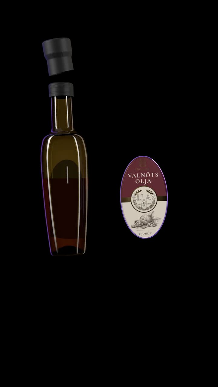
The die cut
Drawn around the Ella’s seal to follow the curve of the bottle. A shape of its own, so the label feels crafted, not stock.
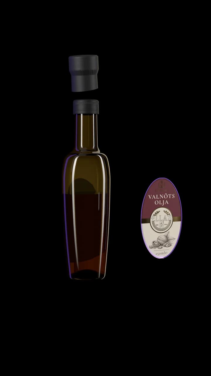
The label
Engraved drawings of what each oil is pressed from, and gold foil, for an old-world feel with a touch of luxury.
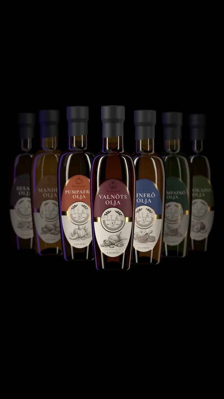
The range
Seven oils, one family.
Each colour comes from its nut or seed: easy to tell apart, clearly one range.
Opens the walnut oil in AR, at its real size.
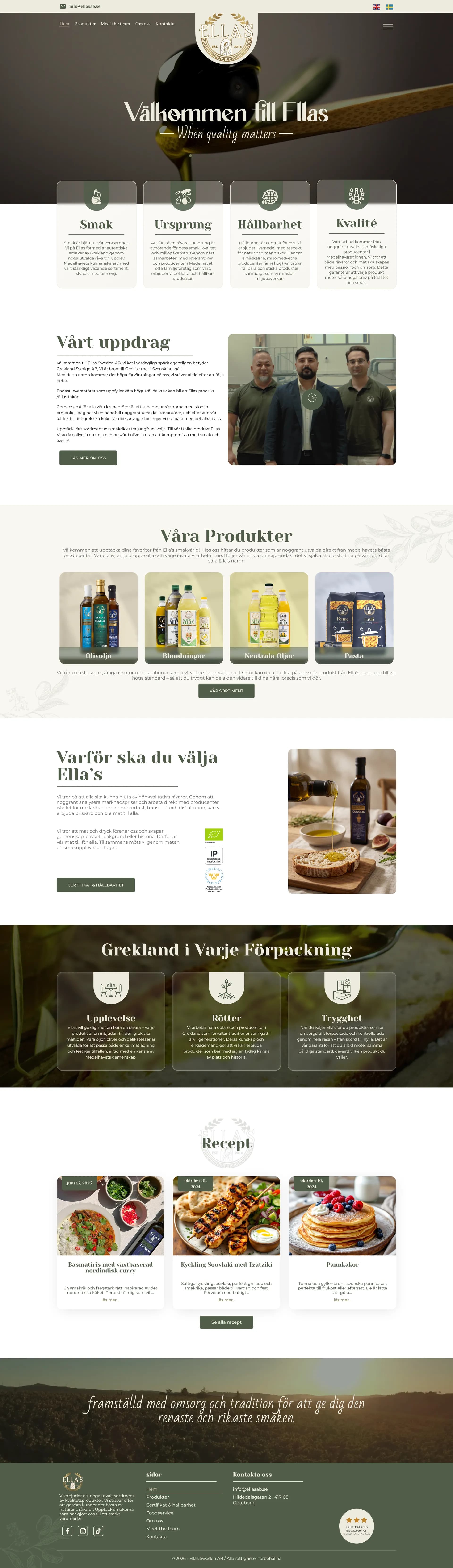
The website
The pages as they were delivered. Scroll inside a screen to read them.

The work
More work
See what else we have built.
Elladia Group
The producer behind the bottle, given a brand of its own
Diamond Events
A box office of their own, from the seat map to the door
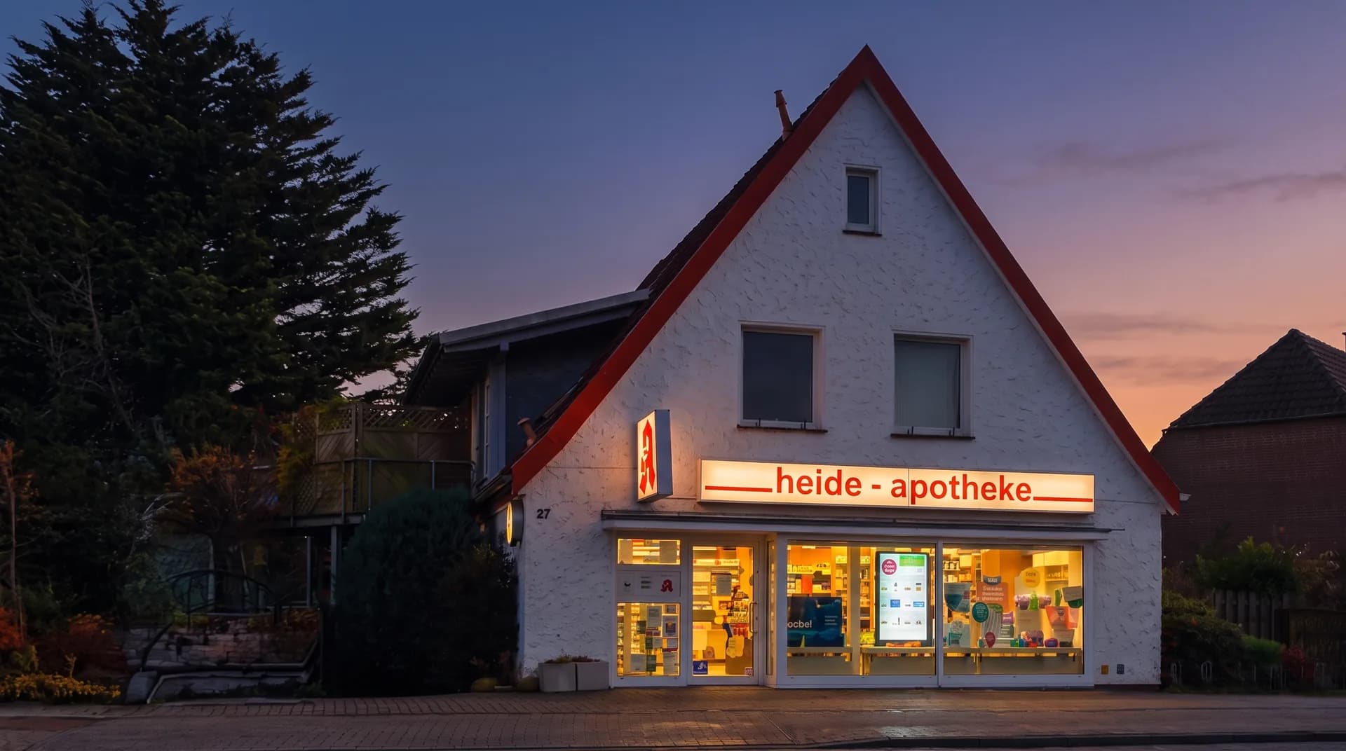
Heide Apotheke
A local pharmacy, as modern online as at its counter